The Challenge
The website structure needed breaking down, inconsistencies identified through an audit, and the existing UI kit adjusted for edge cases. The color palette looked outdated, colors felt faded and worn, and didn't comply with WCAG accessibility standards. Additionally, the palette didn't reflect the community-driven product vision.
The Solution
We implemented a comprehensive design system that supports new features, future scaling, and individual contribution. This included a modernized color palette with accessibility considerations using Leonardo Color, a typographic system with a 1.25× modular scale ratio, and a hardened UI kit that covered all edge cases.
Design Process
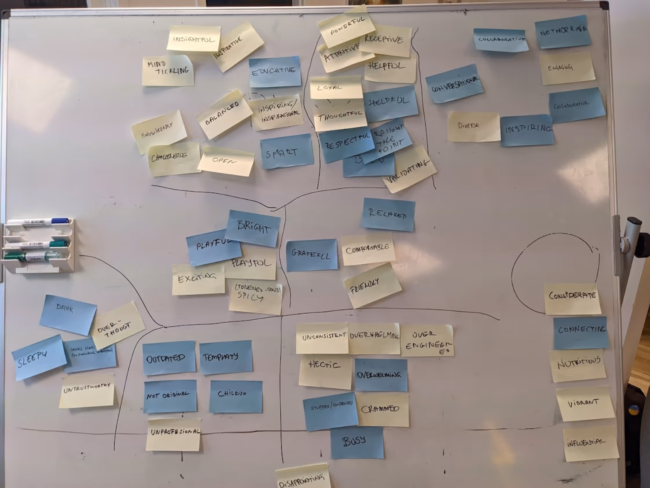
Design Audit
Led by a Figma expert to clarify priorities
Structure & UI Kit Hardening
Breaking down site structure and addressing inconsistencies
Branding Research
Analyzing brand values and visual identity
Color System Development
Creating accessible, brand-aligned color palettes
Typography System
Building a modular type scale with accessibility focus
Client Review
Presenting and refining the design system
Color System Implementation
We implemented a stepwise color workflow to modernize the palette while ensuring accessibility compliance and alignment with the community-driven product vision.
Color Tools Used
Typography System
Type Scale
To create a clear hierarchy, we implemented a modular scale ratio of 1.25× with a 16px base size. This provides consistent progression through heading levels and text elements.
Accessibility Enhancements
Accessibility-focused refinements included careful attention to spacing parameters across all typography elements:
These parameters ensure readable text across all surfaces and devices, significantly enhancing the user experience for all users, including those with visual impairments.
Accessibility Approach
A key focus of our design system was ensuring WCAG compliance throughout all components. The previous color palette failed to meet contrast standards, so we used Leonardo Color to systematically address these issues.
Before
- Faded, worn-looking colors
- Failed WCAG contrast requirements
- Inconsistent application across UI
- Didn't reflect community vision
After
- Vibrant, modern palette
- WCAG AA/AAA compliant contrasts
- Systematic application across components
- Aligned with community-driven vision
Outcomes
Unified Language
Shared conceptual model and terminology for product components
Faster Execution
Shared design resources and code-mapped components
Accessible Foundation
Refreshed palette with WCAG-compliant contrasts
The system's audited structure and hardened UI kit now support new features, edge cases, and individual contributions, setting the stage for sustainable evolution of the product.
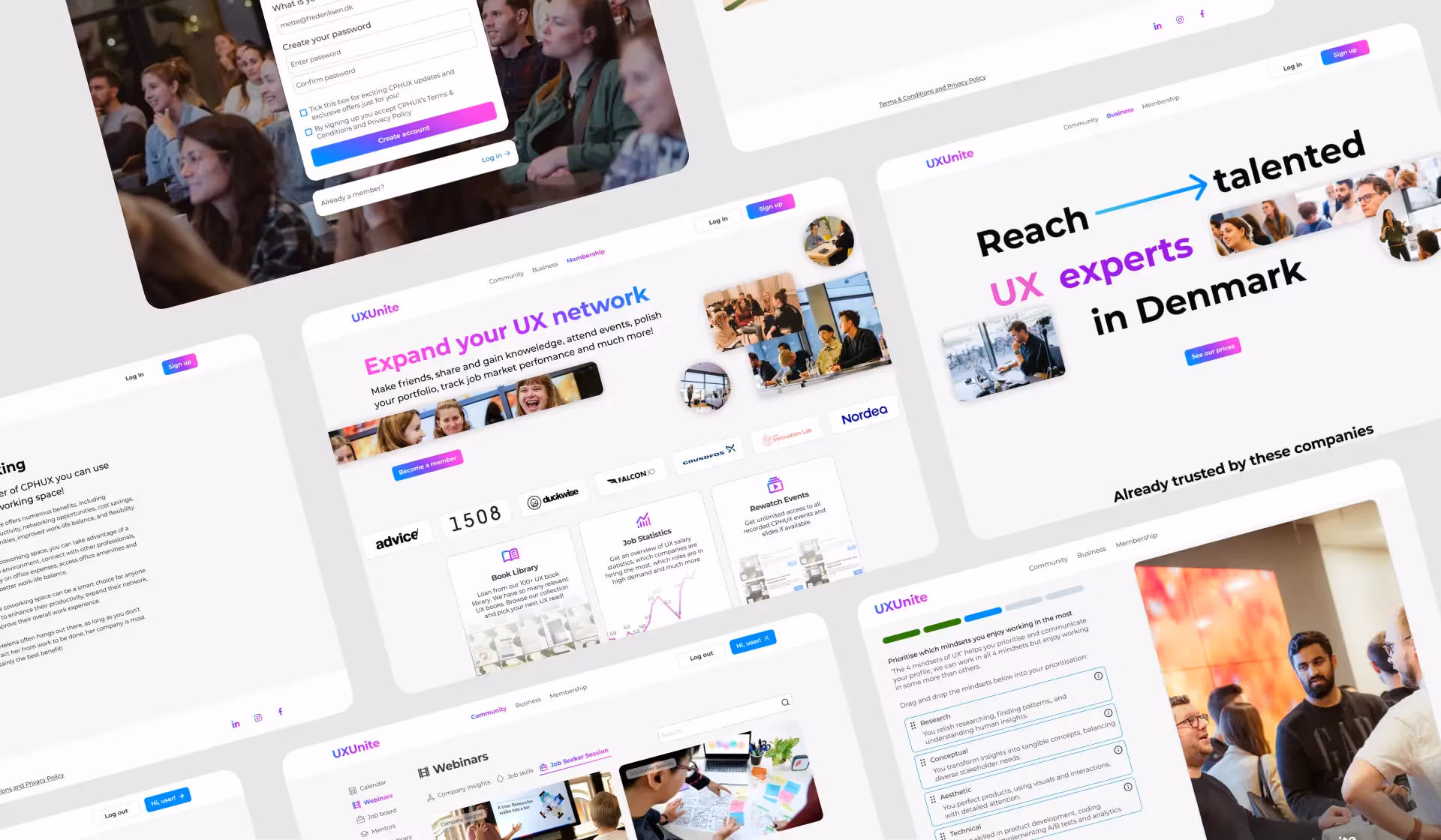
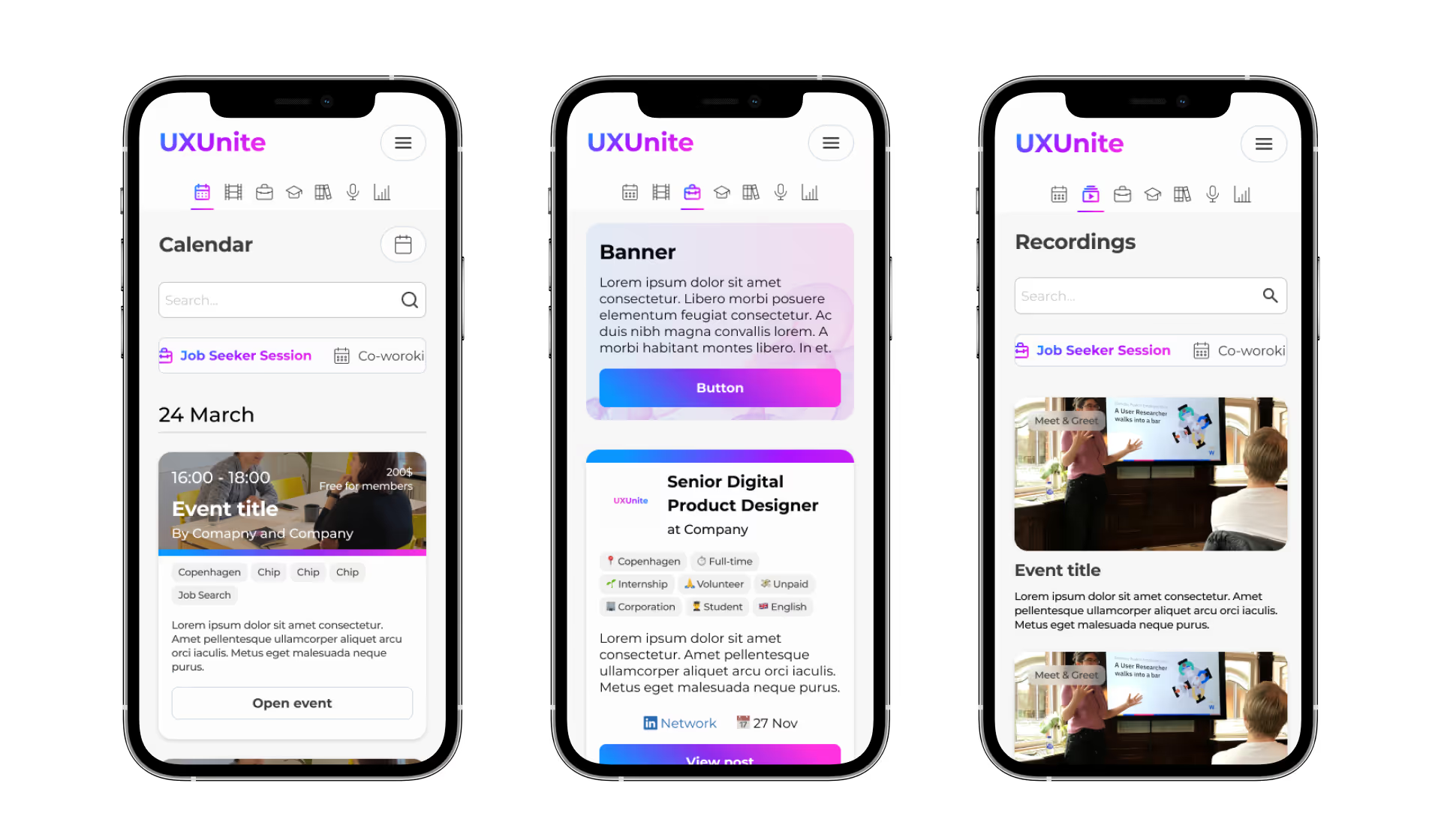
Design System in Action
The completed design system provides a robust foundation for consistent, accessible, and scalable UI development across all UxUnite products.
Need a Design System?
Let's discuss how I can help create a robust design system for your product. I specialize in creating unified design languages that enhance collaboration and ensure consistency.
Start a Project