The Challenge
How might we develop a user-friendly, mobile-optimized website that improves the user experience and engages the target audience? How do we lay the foundation for effective digital marketing for the company?
Limited brand recognition as a new company in the market
Need for a modern, professional expression in digital space
Reaching companies with employees having limited IT understanding
Creating a website that prioritizes mobile optimization and usability
The Solution
A comprehensive website concept emphasizing usability and mobile optimization, with a redesigned logo for a modern, professional expression. The solution includes a prototype built in Figma, competitor and market research, and a design system with consistent components.
Project Scope:
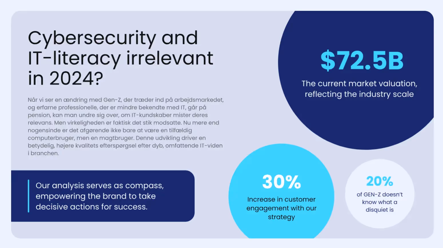
Research & Market Context
An IT company delivering on-site IT-security training in Denmark is relatively unique. While online options exist, few offer the same personal, in-person approach—travelling directly to customers increases accessibility for those seeking IT-security instruction.
SWOT Analysis
Strengths
- • Skilled instructors and high-quality materials
- • Tailored training for company-specific needs
- • Strong digital presentation through an intuitive website
Weaknesses
- • New brand with limited track record and testimonials
- • Limited course variety, potentially narrowing the audience
Opportunities
- • Rising demand for IT courses as even small businesses digitize
- • Portfolio expansion to advanced technologies/sectors
- • Ability to reach international markets via online delivery
Threats
- • Competition from established providers and price pressure
- • Rapid tech change requires constant material updates
- • Economic downturns can reduce training budgets
Target Persona
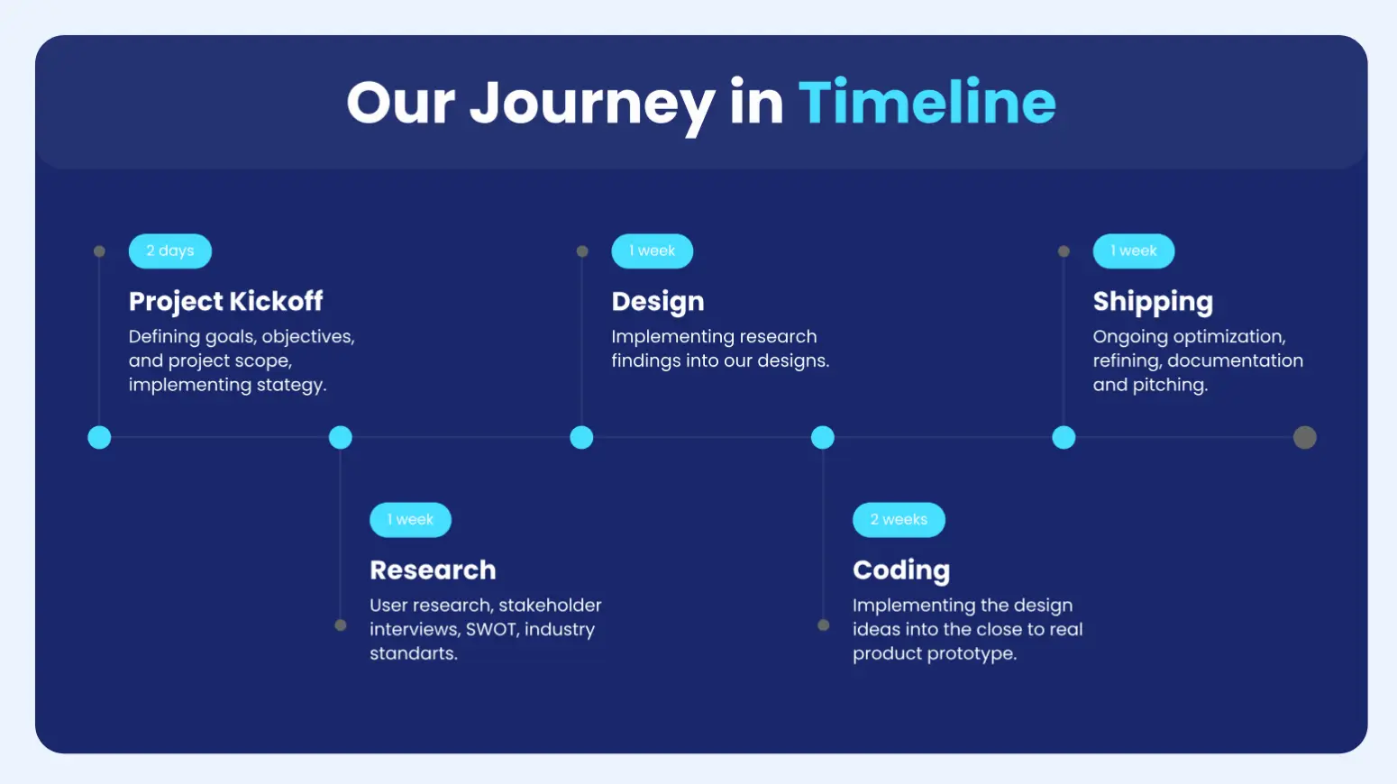
Design Process
Style-tiles & Moodboards
Individual exploration and team alignment on visual direction
Wireframes
Creating the structural foundation using design principles
Design System
Creating a UI kit with standardized components
Prototype Development
Building the interactive Figma prototype
Logo Redesign
Updating the brand identity
Development Setup
Preparing for front-end implementation
Responsive Implementation
Building the responsive front-end
Models & Principles Applied
Branding
The branding process began with client orientation followed by research on positioning, identity, and primary/secondary audiences, culminating in the visual identity. We took a minimalist approach (a nod to KISS principles) to improve accessibility and appeal. The color palette was designed to communicate security and trust in technology, with complementary and functional colors supporting both UI and marketing.
Original Logo
A simplified owl design that unfortunately evoked associations with a library or zoo rather than an IT company.
Redesigned Logo
A shield with a mouse click symbol—creating a clear and immediate association with IT-security.
Engineering & Delivery
Collaboration & Setup
We established a GitHub environment where team members could collaborate efficiently. Pages and components were divided between team members to optimize workflow. Working with a design system significantly reduced duplication, as members didn't have to re-code the same elements twice.
Key Code Decisions
- • Global reset with
* { margin:0; padding:0; }for cross-browser consistency - •
box-sizing: border-box;for predictable sizing - • CSS variables for color tokens to enforce the design system
- • CSS Grid with
repeat(auto-fit, minmax(200px, 1fr))for responsive layouts
Responsive Web Design (RWD)
Outcomes
User-Friendly Website
Mobile-optimized with intuitive navigation and accessible design
Modern Brand Identity
Refreshed logo with clear IT-security association
Solid Digital Foundation
Framework for future marketing and business growth
The project successfully delivered a user-friendly, mobile-optimized website with a modern brand identity. Despite starting with 5 team members and finishing with 2 active collaborators, we managed to create a comprehensive digital presence that effectively communicates IT-Workshoppen's services and values to their target audience.
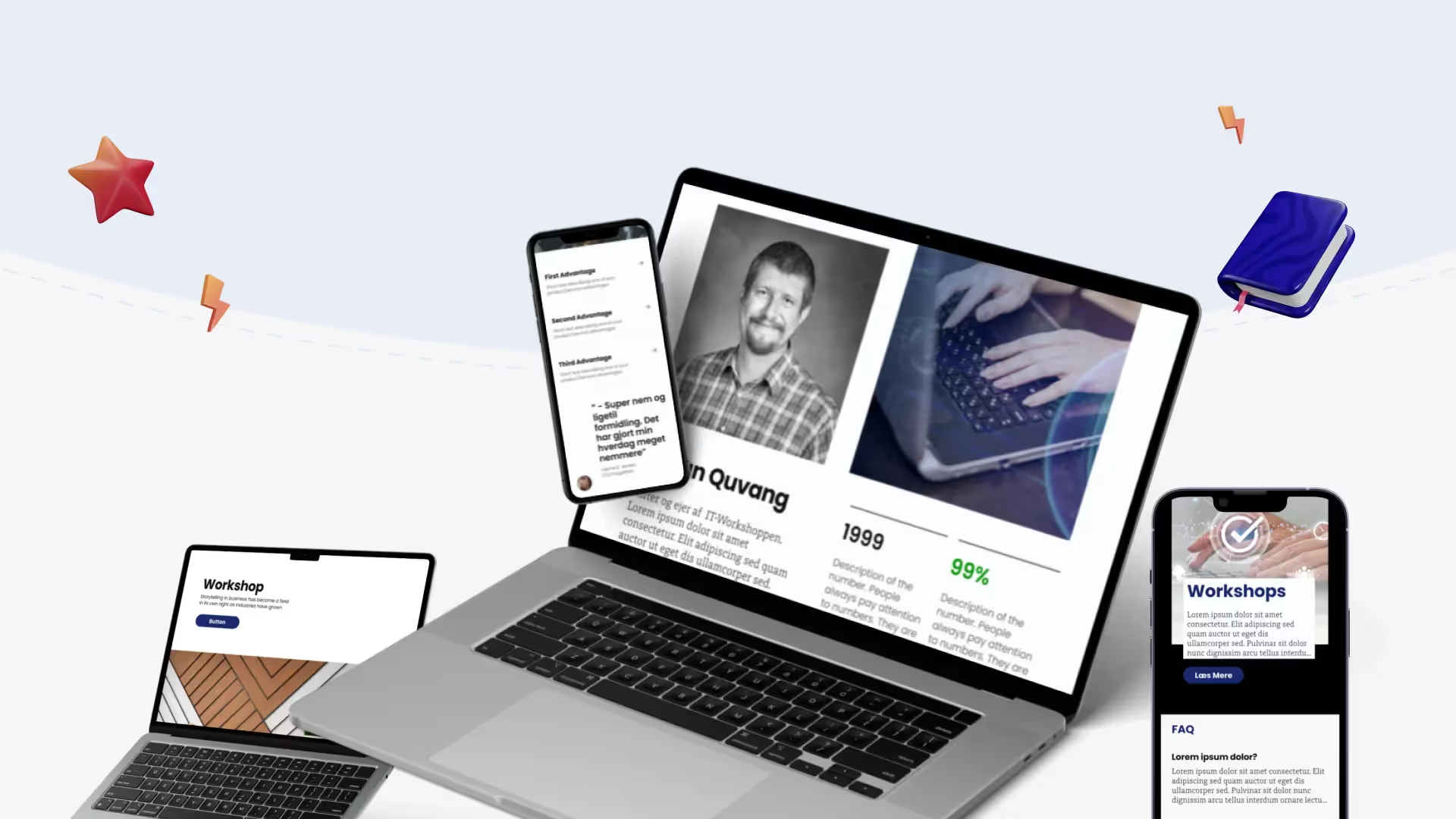
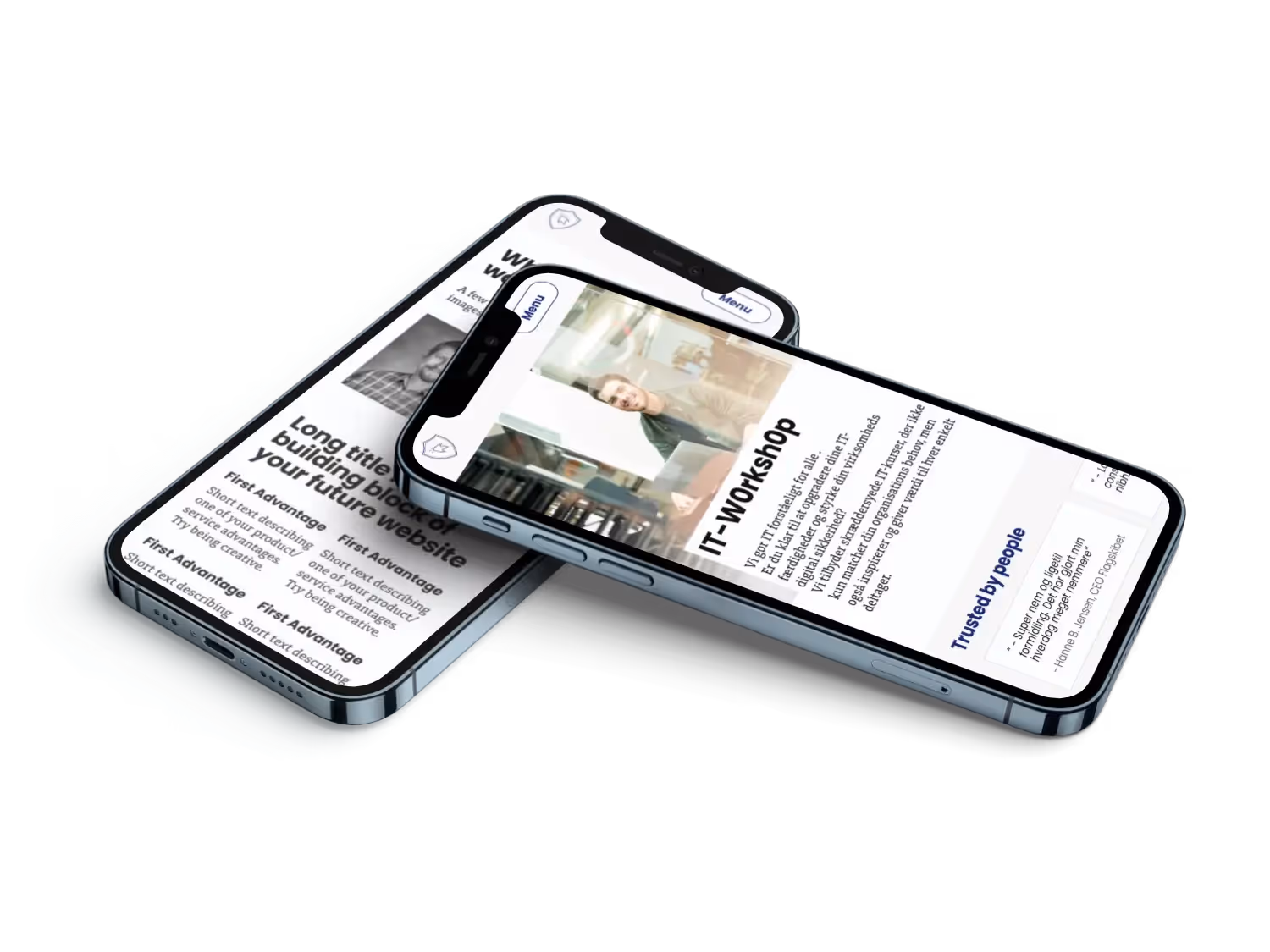
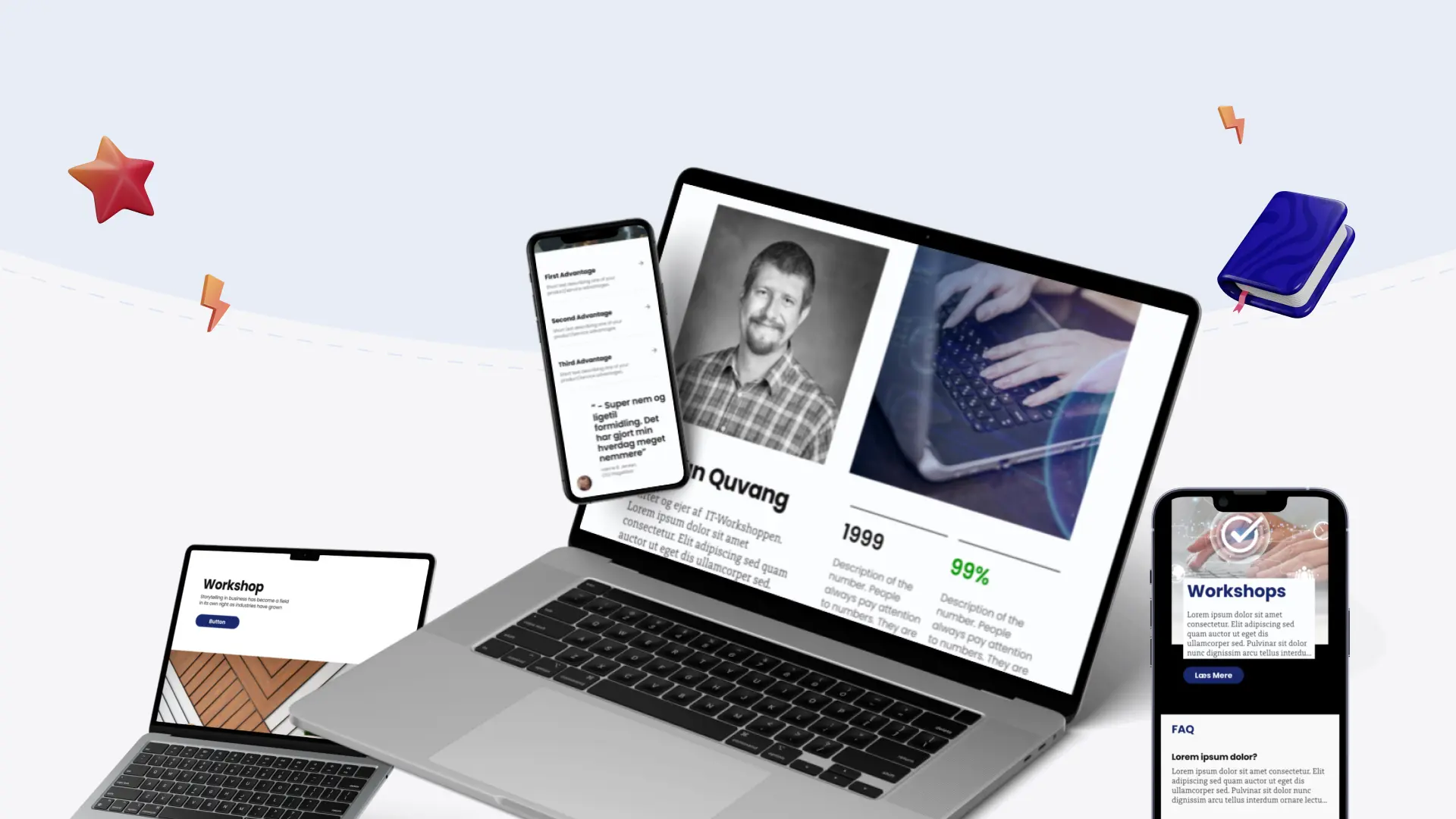
Visual Showcase
Need a similar solution?
Let's discuss how I can help design and develop a user-friendly, mobile-optimized website for your business that effectively communicates your unique value proposition.
Start a Project