The Challenge
Create an ecommerce website that effectively communicates the environmental, economic, and comfort benefits of using Firefly. The site needed to address both potential buyers and existing owners, including product instructions and documentation. The interface had to be simple and user-friendly, reflecting the product's philosophy of ease of use, while also delivering a new logo and visual demonstration of how the product works.
The Solution
A modern, responsive, and minimalist UI design that focused on clarity and intuitive navigation. The design process used Hick's Law to refine navigation and reduce decision time, along with clear, visually distinct calls-to-action. We delivered a new logo design following a flat, 2D monochrome direction, and created an animated infographic to visually demonstrate the product's functionality.
Design Process
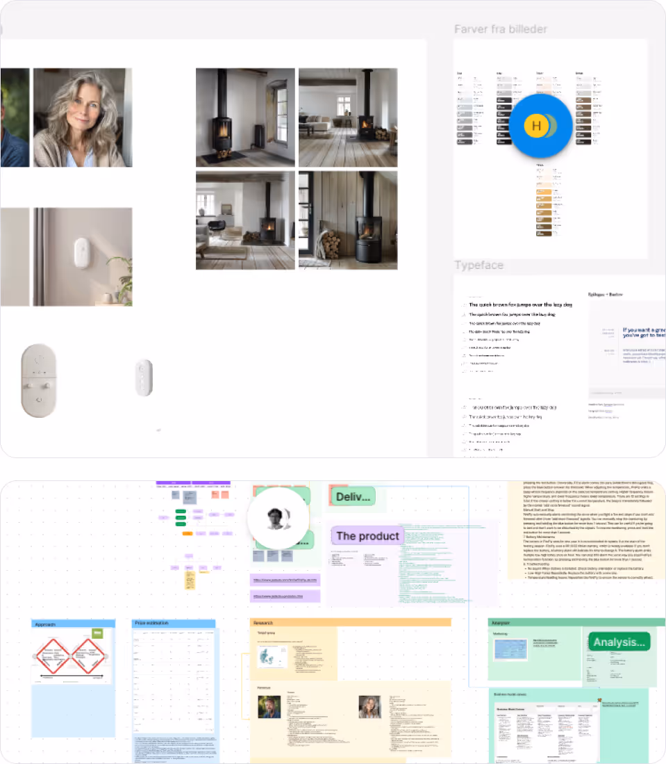
Research
Understanding internal and external factors
Business Model Development
Mapping out the business strategy
Concept Development
Creating the design principles
Logo Design
Creating brand identity
Design Collaboration
Team-based design process
Usability Testing
Evaluating the design with users
Design Refinement
Improving based on user feedback
Project Estimation
Planning for development
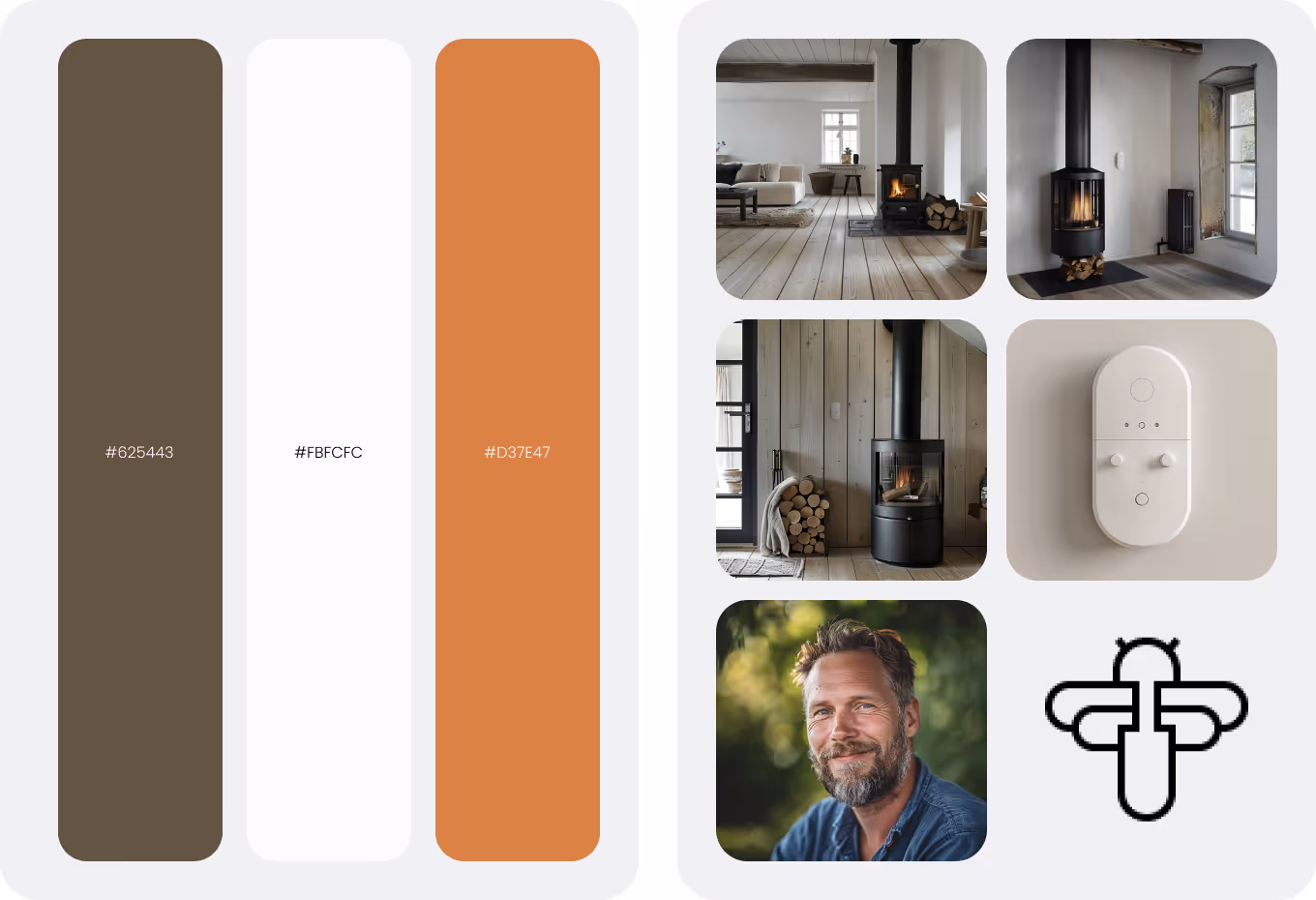
Visual System
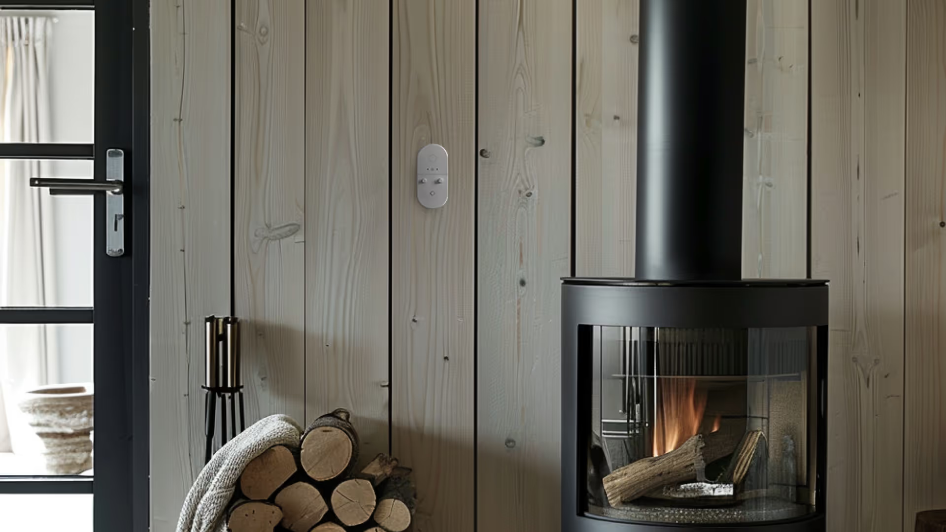
A clean, warm-toned visual system that reflects the comfort and environmental focus of the Firefly product, using earthy colors that evoke wood and fire elements.
Typography
Cardo (serif) type family
Used for both headings and body text to create a cohesive, elegant experience
Design Tools
Research Findings
Target Audience
Business Model
Design Principles
The design process focused on creating a user-friendly interface that reflected the product's philosophy of simplicity and ease of use. We implemented several key design principles to achieve this goal:
Modern UI
Modern, responsive, minimalist UI for broad device access and clarity, ensuring all users can easily navigate the site regardless of their device.
Intuitive Navigation
Navigation refined using Hick's Law—reducing choices to minimize decision time and avoid paralysis, making the user journey smooth and straightforward.
Clear CTAs
Visually distinct calls-to-action using imperative wording ("Buy", "More info") to guide users toward key actions and conversions.
Branding
Logo design followed a flat, 2D monochrome direction based on competitive scan of similar products and Danish design principles.
Usability Testing & Improvements
Testing Method
We conducted think-aloud usability tests with potential users to identify issues and areas for improvement in the early design. This revealed two key issues that needed addressing:
Aesthetic Clarity
Early build felt inconsistent and not aligned with the product; users wanted more visuals.
Manual Findability
Manual was hard to discover (nested under sorting).
Estimation & Planning
To ensure accurate project scoping and planning, we implemented the Delphi method with three experts who independently estimated time and costs for:
Outcomes
Clearer Value Communication
Site structure and CTA placement tie benefits directly to key paths
Improved Content Discoverability
Manual relocation and richer visuals including animated infographic
Brand Foundations
New logo and visual demonstration establishing consistent identity
The Firefly ecommerce website successfully communicates the environmental, economic, and comfort benefits of using the product. It addresses both potential buyers and existing owners with intuitive navigation and clear product information. The minimalist design reflects the product's philosophy of simplicity while effectively showcasing its functionality.
Visual Showcase
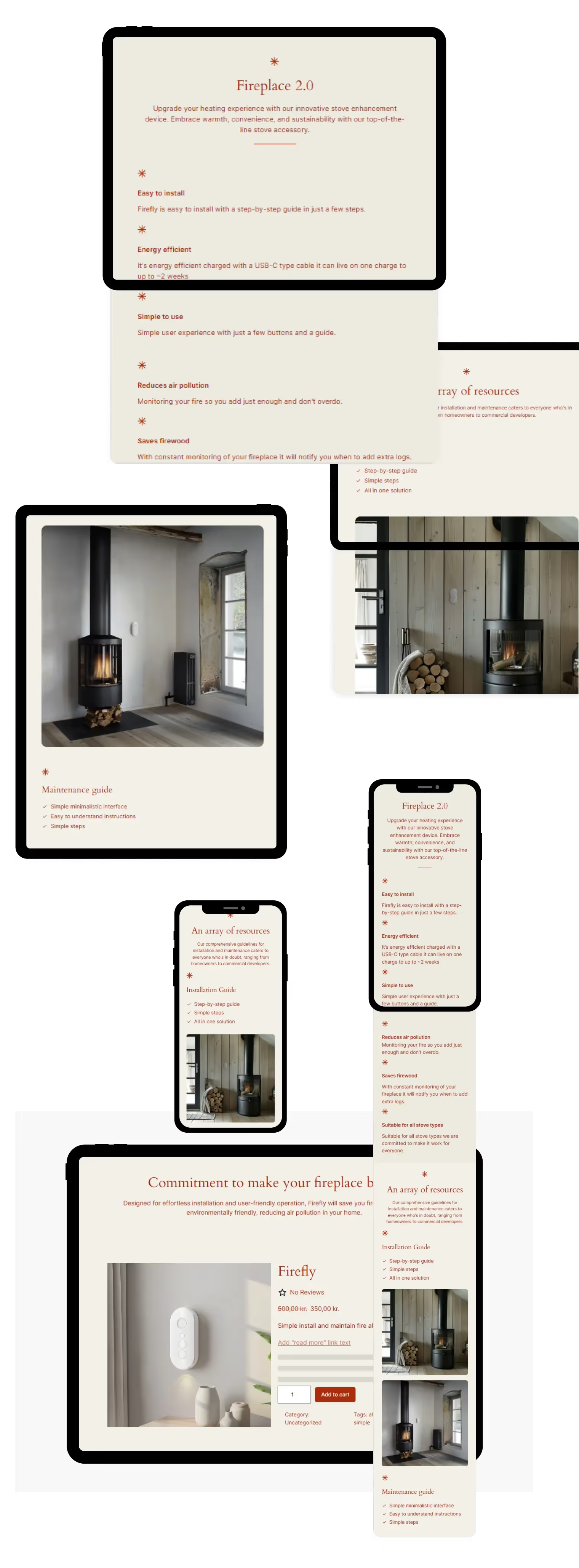
Product Animation
An animated demonstration of Firefly stove alarm infographic.
Need an ecommerce website?
Let's discuss how I can help design and develop an ecommerce site that communicates your product's value effectively while providing a seamless user experience.
Start a Project